Thursday, May 10, 2012

Painting the stone


Time to paint the letters. I let the shellac dry overnight and this morning had John walk me through the steps of mixing the right shade of gray that will stand out once the stone is waxed. We used an oil-based enamel called 1 Shot, favored by signwriters because it dries so quickly. The method used here is called "flood painting" for obvious reasons, but it's a somewhat misleading name because the process does require careful application. You sort of feather it on with a paint brush, working from the bottom of the v out to the edge for a clean coating. I got into the habit of going two letters forward, one letter back, touching up any light areas I missed with the first pass. I saw every detail again for the first time, but instead of seeing them as alphabetic shapes, it was all a maze of angles and planes. The glossy finish highlights every chip and wobble, and though, full disclosure, there are a few of those, I'm glad to say that otherwise I did a pretty clean job of it. Should be dry enough by mid-day tomorrow to grit off the excess paint.


Wednesday, May 9, 2012

End Phase I


With only a few days to spare, I finished carving my alphabet stone. The protective tape border has been removed and the fixative gritted off. Now after a thorough rinse I'll be able to see what I'm doing. Or rather what I've done. Without the white outlines my letters will stand in relation only to each other, and the success of the piece will come down to how well I was able to maintain a consistent depth and width to all of the various weights, thick/thin, stem/leg, crossbar/bowl. I was reminded of Paul Valery's rather elegant fatalism, that a poem is never finished, only abandoned. At some point you just have to put your tools down and walk away. Or pick up new tools, like a paint brush or gilding materials. (I'm going with the former. Gilding demands perfection.)

It is perhaps a bit early to begin offering a final analysis, but it occurs to me that what I've learned most over the last six weeks is not so much how to do it right as to see what's wrong. There is no question that I'm leaving a vastly improved carver, nor would I dispute the fact that this alphabet is the best I can do, the best I have done. But if this has been a sort of lettering boot camp, I'm probably still too busy burning fat to gain a lot of muscle. But it will come. Someday I'll be ripped! I mean, good at lettering. End of metaphor. Alright, the stone is dry, let's see what we've got.


Well, what we've got are some spacing issues (RS, XY). And my Q belongs to a slightly larger alphabet. And from a layout standpoint it's a little bottom-heavy. But overall it offers its fair share of satisfactions. Almost every letter is better than any other version I've yet drawn, brushed and carved. It is a portrait of this moment in my development and is thus full of information about what to do differently the next time an alphabet stone comes around. I did a rubbing for archival purposes, which gives a better sense of the letter shapes. At least it does in person.


The next step is to seal the inscription with a coating of shellac. This will prepare the letters for painting, which John demonstrated on my earlier practice stone.


I'm going for a rather conventional gray, which will contrast nicely with the oiled black slate. I'll experiment with more whimsical color schemes on future projects. I want to keep this one clean and simple. It's anything but clean now. But that excitement the carver feels when he grits off the excess paint and sees the letters emerge from the water, man. I'm told it never goes away.


Monday, May 7, 2012

Brooke Roberts


After work on Friday I paid a visit to the Newport workshop of Brooke Roberts, a JSS alum from the oft-invoked "Golden Age" of the mid- to late-seventies. Back then he was an artistically inclined teenager looking for a summer job. Instead he found a lifestyle. He still carves, often employing Paul Russo to help get the work out the door, but like John Benson, who hung up his chisels for a working retirement in sculpture, his first love, Brooke is in the slow process of transitioning back to the canvas. We talked for a half hour or so about his work, some memorable projects and general aspects of the craft. I found him easygoing and good-humored, a master who wears it lightly. His shop is pretty much the ideal one-man operation, especially for those of us who don't have 300 years to spend waiting around for the atmosphere to ripen.


And he has a most enviable library.


What I took away from Brooke that I appreciated most was the reminder that there is room in the carving world for lettering methods other than those perfected by the John Stevens Shop. Calligraphic genius, mercifully, is not a prerequisite, at least not yet.


Saturday, May 5, 2012

Providence walkabout

On my way back to Newport on Thursday I decided to spend a few hours in Providence wandering around the campuses of RISD and Brown in search of inscriptions. I was not disappointed. Knowing that JHB taught at RISD for a while, I began my search there.


This building was not actually named in JHB's honor, though it might have been given his devotion to the school. Interestingly the man for whom it was named, Henry K. Benson, taught at RISD (1904-1954) for roughly JHB's entire lifespan (1901-1956). I suppose after fifty years of dedicated service a watch would appear rather cheap. Down the street from Benson Hall was the only plaque I was able to find on the RISD campus, although neighborhood seems like a more fitting description of the school's layout. Nestled on parts of a hill not otherwise occupied by Brown, it has an intimately urban feel, as if the school spread from building to building as they became available. Which is probably what happened. At any rate, the plaque is lovely and sort of the school's founding document.


Tucking a lowercase letter into the bowl of the capital C is a stylistic convention I found on a few other stones as the day progressed. Here it is both a canny spacing solution and a personalized flourish, lending a continuity to the scattered collection. I wandered up the hill without much further luck until I came to the gates of Brown. I entered at Carrie Tower and walked over to the College Green, and as I scanned the facades of buildings telltale dark rectangles began to emerge from the matrices of brick and stone. The first one I encountered was outside the Salomon Center, featuring large Roman capitals painted a soft aquamarine, contrasting nicely with the purple slate. I'm not sure what it is about the letters that makes me think they're not ex-JSS, maybe the stroke weights seem thinner than usual. Also they look a little stiff. Given the exfoliation of the paint job it has been around for a while. (Google tells me the building was dedicated in 1989.) Judging by the overall condition it appears to have lost the power to command respect.


I tried to scrub off the mysterious white substance but it didn't do much good. For all the human capital that goes into producing a stone, that students think nothing of taping up notices over the work and leaving the adhesive to rot is enough to make the carver leery of university commissions. This carelessness was even more egregious, unsurprisingly, in an area of the campus with a high concentration of frat houses.


I did what I could, for JHB's sake.


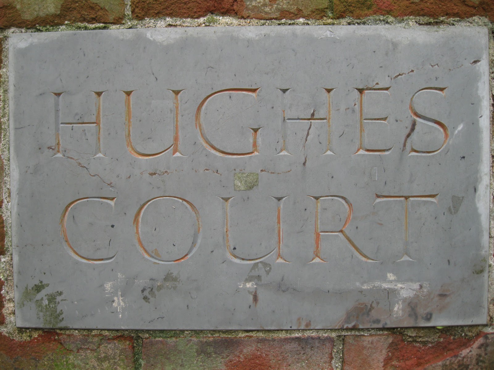
There is an interesting story behind this inscriptional trove waiting to be told. There are plaques on three sides of a little brick structure on the edge of Hughes Court remembering the contributions made to the Brown community by Charles Evans Hughes and his son CEH III. The elder Hughes' plaque is done in fine classical style, as dignified as a gravestone and certainly the work of JHB.


Notice the fairly open splay of the V and the spacing of the letters. They will look familiar when we consider the plaque for poor CEH III. The layout is identical to his father's stone, but a closer look will reveal a significant and rather incriminating difference.


It appears that the layout was traced from a rubbing of the original, cut into a rubber stencil and lightly sandblasted for a result that, at a distance or up close but drunk, bears a family resemblance to the genuine article. My guess is that some hack in the "Development" office had the bright idea to cut (or rather blast) corners, save some money and throw up an inferior product expecting people not to notice, or notice and not care. It is clear that no one with an ounce of aesthetic sensitivity had anything to do with the project, or else a better attempt would have been made at an acceptable bodge. This so fundamentally misunderstands the point of carving letters in stone that it's...funny. It's hilarious. Look at this.


And this. At Brown University.


And when they didn't have a model to copy they "designed" one, like this upside-down p of a lowercase d. Never mind that in the same space as "3d" they could have inserted the more monumental "III".


Somehow they combined badly interpreted hard-carved letterforms with the terrible application of a different mechanical process and wound up with a plaque that must stand as the nadir of visual intelligence in the making of memorials in stone. Simply breathtaking. Let's move on.


It's hard to get a good picture of this beautiful inscription in its entirety, especially on a flat overcast afternoon. But it rewards a closer look, as magnificent as the "CEH 3d" stone is dreadful.


I know, like, seriously. A dedicatory address from 1952, this stone is a bravura performance that came late in JHB's career. The subtle calligraphic irregularities give to the long lines a cadence of effortless virtuosity, the work of a master at play. The flaking paint might have spoiled the effect with a certain shabbiness if not for the immaculate carving. I love how the pairs of g's, s's and o's retain the individual act of their creation, the light influence of an idea in a moving hand. And check that italic umlaut.


Sometimes the carver has to contend with deposits in the stone which can break his chisel and perhaps his spirit. With this iron birthmark, there was no way around it, only through. No problems here.


I found a few other stones worthy of description, but they'll have to wait for another day and maybe better light. Providence has plenty of gold for any lettering prospector willing to hit the bricks. Plenty of schist too, but I'm glad to say these proved to be the exception and not the rule. The Benson family's influence is simply too widespread. As a parting shot, another fine example. Hey drain pipe, a little to the left.


Friday, May 4, 2012

PechaKucha

Wednesday evening was the Annual Meeting of the Society of Printers. To get to Boston I took the path of most resistance, a bus from Newport to Providence and then a train into South Station. A four-hour commute thanks to a 45-minute "layover" in Providence, but I can hardly complain as it was so cheap. And it gave me plenty of time to sink into Seamus Murphy's hilarious and poignant Stone Mad, both a classic of the genre and the genre's only book: the memoir of an Irish stone carver. It has the same rustic humor and narrative polish as anything by James Herriot, but instead of tending to the needs of ailing livestock and their flummoxed owners, Murphy chronicles the habits and foibles of other cunning animals, the men who shaped and hewed and incised a country full of cathedrals and gravestones from the very living rock almost a hundred years ago. The fondness with which he treats his apprentice days definitely struck a chord as I made my way to Boston, in my coat pocket the notes for a talk I was due to deliver that evening as part of the SP's Annual Meeting festivities on the subject of my own brief apprenticeship at the John Stevens Shop. Murphy started when he was in his late teens and by the time he was my age, 32, he was flirting with mastery. Though I've come into the game a bit late by classical standards, it occurred to me that this state of early learning, what they taught me at Naropa to call "beginner's mind", is the secret to a kind of stimulating youthfulness. As a broad passion for written language and shared meaning manifested first through typography and now through lettering in stone, with wood engraving possibly on deck, it is exciting to think that I may always enjoy this thrill of apprenticeship. Stay open, keep learning. Write that down, print it. Or carve it in stone.

That was the daydream that wafted me into Boston. As a customary grace note to these SP Wednesdays there was a lunch planned at Jacob Wirth's in the Theater District with a few fellow printers, carrying on a tradition going back to the days when Walter Muir Whitehill strung a cable of pipe smoke connecting Jake's across the Common to his desk at the Boston Athenaeum, where he was Director and Librarian from 1946 to 1973. Here's a picture of him standing over Carl Purington Rollins at the latter's 75th birthday party in 1955, incidentally attended by one John Howard Benson shortly before he died.


It was a smaller group than usual, but we made up for it in good talk and an impromptu show and tell. The photograph came from one of Toby Hall's magic folders, which invariably contain delightful pieces of ephemera from an age when any dinner gathering of more than one printer was excuse enough to whip up a specially printed menu or keepsake for the occasion. Toby himself was a protege of Whitehill's and produced copies of the late scholar's personal stationery with a pen and ink drawing by Rudolph Ruzicka, printed by The Stinehour Press.


With Whitehill presiding over our lunch in spirit, it seemed only fitting to spend the few hours left until the SP meeting at the Athenaeum. I read over my notes on the fifth-floor terrace high above the Granary Burying Ground, thought about the prospect of speaking before the Society for a firmly regimented 7 minutes and considered taking the advice of a few friends who told me to break a leg. They could hardly expect me to give a speech with a broken leg. Alas. It's not as easy to do as it sounds. I was going to have to go through with it.

I spent the social hour of the meeting catching up with old friends and fielding questions about my time in Newport. There was a general excitement in the air for the evening's entertainment, called a PechaKucha for the Japanese term for the sound of "chit chat". Seven speakers each show 21 slides on a given subject, speaking for 20 seconds per slide for a total of seven minutes. It was a huge hit two years ago when it was introduced to liven up the Society of Printer's final meeting of the year. The topics ranged from world calligraphy to naughty and bizarre books to works of remembrance from a woman whose family endured the Holocaust. I had changed the title of my talk from the bland "Typography in Stone" to the more appropriately theatrical "Crouching Carver, Hidden Alphabet", evoking my attempts as grasshopper to snatch a carved pebble from the master's palm. Something clicked when I saw my name on the projection screen indicating that I was next. It suddenly felt very natural to be up there talking to people about my experience. The format never tripped me up, I didn't feel rushed and I heard a modulating confidence in my voice that never came out in the rehearsal. I actually enjoyed myself. The work is hard, do the work. It was over before I knew it and as I retreated to the back of the room amid the applause from friends and colleagues, I was made perfectly aware that others enjoyed it too. 


Tuesday, May 1, 2012

Exit Nick and Paul


Early on a wet and raw Tuesday morning, Nick and Paul set off for the FDR Memorial on Roosevelt Island in NYC, where they'll be spending the next month and a half carving the inscriptions that will put the finishing touches on Louis I. Kahn's resurrected design. The memorial was shovel-ready in the early seventies, but when the city went bankrupt in 1975 the project was shelved indefinitely. Now it has been taken up by a number of philanthropic New Yorkers and realized essentially without modern corporate interference. Rare indeed.

Nick and Paul were psyched to get moving, even in a cold rain, an enthusiasm that was half "Road trip!", half "Git 'er done!" They take with them much of the comic fraternity that makes the JSS such an awesome place to work for. Josh and I, the honorable left-behind, will still manage to have a good time, after all the work itself is fun. But doesn't it feel like the whole show is coming to a close, at least this chapter. It does. Because it is. Less than two weeks to go. However, in terms of what I need to get done before I head back to Boston, I don't have much time for moping by the window. Last time I checked the alphabet doesn't carve itself!


Just under halfway to Z. The letters are 1.5 inches tall, larger than anything else I've yet practiced on, so of course I'm working even more slowly than usual. I'm also trying to absolutely nail it, which makes for all lente and little festina. The trick will be to get up to a decent speed, maybe 2.5 letters an hour, to make the endeavor remotely profitable. Another limiting factor is the Italian slate, which plucks if you carve too aggressively. Plucking is the very irritating damage resulting from some combination of too fast, too soft and too dull. The chisel catches on the stone instead of gliding through, essentially ripping out tiny chunks of slate and leaving black sockets that require more material than might be available to clean up. I think I've about got it under control.


Birthday at the JSS


On Saturday I celebrated my birthday at the John Stevens Shop with some family and a few close friends. I won't say that I timed the apprenticeship specifically to fall on my natal month, but the fact is not out of keeping with the general serendipity marking this moment in my life. By mid-afternoon we were about a dozen strong, mostly printers and lettering enthusiasts taking in the museum-like atmosphere, when Nick arrived to explain some of his methods and show off some work.


This is a stone featuring his version of the Rustic Roman style adapted from a similar interpretation designed for a wooden sign by John Hegnauer and which hangs from a beam in the shop, serving the dual purpose of keeping our heads up and us working to a high standard. Not that Nick would ever let us lose sight of the latter. At any rate, after he left to enjoy the rest of his Saturday we decided to spend ours on a field trip to the Common Burying Ground, to see the graves of John Howard and Esther Fisher Benson and whatever else caught our eye.


The coastal air carried a refreshing scented chill and the light leaned in for a good look at the work of those robust Colonial carvers. As a tour guide my speech basically consists of, "Hey, look at this amazing, heartbreaking and poignant six-headed stone by John Bull." I've made more than a few visits here and it has lost nothing of its impact. 


It is so beyond the imaginative scale of any other work of Colonial carving that I've seen, I have to wonder if it has any rivals or what sort of precedent Bull had to work from. Perhaps the story is told in Vincent Luti's Mallet and Chisel, about the lettercarvers in 18th-century Newport.

From the Common Burying Ground we proceeded to Yesterday's for dinner and a few celebratory ales. The main entertainment for the evening was a raffle to rename my press, which I've been considering to incorporate carving into my "identity." Some highlights included Leopardskin Pillbox Hat Press and Chisel, Jellybean Press and Heavy Things, Marks 4 U, and Jesse the Jobber. Good suggestions all. I'll think about it. Cheers to family and good friends sharing an awesome time in a special place.