
This building was not actually named in JHB's honor, though it might have been given his devotion to the school. Interestingly the man for whom it was named, Henry K. Benson, taught at RISD (1904-1954) for roughly JHB's entire lifespan (1901-1956). I suppose after fifty years of dedicated service a watch would appear rather cheap. Down the street from Benson Hall was the only plaque I was able to find on the RISD campus, although neighborhood seems like a more fitting description of the school's layout. Nestled on parts of a hill not otherwise occupied by Brown, it has an intimately urban feel, as if the school spread from building to building as they became available. Which is probably what happened. At any rate, the plaque is lovely and sort of the school's founding document.


Tucking a lowercase letter into the bowl of the capital C is a stylistic convention I found on a few other stones as the day progressed. Here it is both a canny spacing solution and a personalized flourish, lending a continuity to the scattered collection. I wandered up the hill without much further luck until I came to the gates of Brown. I entered at Carrie Tower and walked over to the College Green, and as I scanned the facades of buildings telltale dark rectangles began to emerge from the matrices of brick and stone. The first one I encountered was outside the Salomon Center, featuring large Roman capitals painted a soft aquamarine, contrasting nicely with the purple slate. I'm not sure what it is about the letters that makes me think they're not ex-JSS, maybe the stroke weights seem thinner than usual. Also they look a little stiff. Given the exfoliation of the paint job it has been around for a while. (Google tells me the building was dedicated in 1989.) Judging by the overall condition it appears to have lost the power to command respect.


I tried to scrub off the mysterious white substance but it didn't do much good. For all the human capital that goes into producing a stone, that students think nothing of taping up notices over the work and leaving the adhesive to rot is enough to make the carver leery of university commissions. This carelessness was even more egregious, unsurprisingly, in an area of the campus with a high concentration of frat houses.

I did what I could, for JHB's sake.
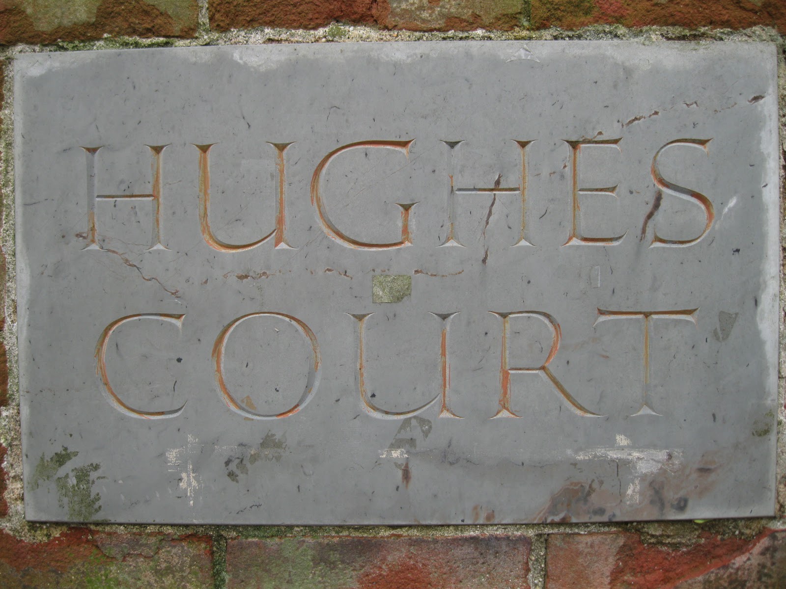
There is an interesting story behind this inscriptional trove waiting to be told. There are plaques on three sides of a little brick structure on the edge of Hughes Court remembering the contributions made to the Brown community by Charles Evans Hughes and his son CEH III. The elder Hughes' plaque is done in fine classical style, as dignified as a gravestone and certainly the work of JHB.


Notice the fairly open splay of the V and the spacing of the letters. They will look familiar when we consider the plaque for poor CEH III. The layout is identical to his father's stone, but a closer look will reveal a significant and rather incriminating difference.


It appears that the layout was traced from a rubbing of the original, cut into a rubber stencil and lightly sandblasted for a result that, at a distance or up close but drunk, bears a family resemblance to the genuine article. My guess is that some hack in the "Development" office had the bright idea to cut (or rather blast) corners, save some money and throw up an inferior product expecting people not to notice, or notice and not care. It is clear that no one with an ounce of aesthetic sensitivity had anything to do with the project, or else a better attempt would have been made at an acceptable bodge. This so fundamentally misunderstands the point of carving letters in stone that it's...funny. It's hilarious. Look at this.

And this. At Brown University.


And when they didn't have a model to copy they "designed" one, like this upside-down p of a lowercase d. Never mind that in the same space as "3d" they could have inserted the more monumental "III".

Somehow they combined badly interpreted hard-carved letterforms with the terrible application of a different mechanical process and wound up with a plaque that must stand as the nadir of visual intelligence in the making of memorials in stone. Simply breathtaking. Let's move on.

It's hard to get a good picture of this beautiful inscription in its entirety, especially on a flat overcast afternoon. But it rewards a closer look, as magnificent as the "CEH 3d" stone is dreadful.

I know, like, seriously. A dedicatory address from 1952, this stone is a bravura performance that came late in JHB's career. The subtle calligraphic irregularities give to the long lines a cadence of effortless virtuosity, the work of a master at play. The flaking paint might have spoiled the effect with a certain shabbiness if not for the immaculate carving. I love how the pairs of g's, s's and o's retain the individual act of their creation, the light influence of an idea in a moving hand. And check that italic umlaut.


I found a few other stones worthy of description, but they'll have to wait for another day and maybe better light. Providence has plenty of gold for any lettering prospector willing to hit the bricks. Plenty of schist too, but I'm glad to say these proved to be the exception and not the rule. The Benson family's influence is simply too widespread. As a parting shot, another fine example. Hey drain pipe, a little to the left.

No comments:
Post a Comment